
 Gwisted
Community
Players Criticize Valorant's New Game Mode Picker
Gwisted /
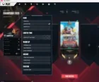
A Reddit user expresses strong dissatisfaction with Valorant's updated game mode selection interface, describing it as a significant downgrade from the previous full-screen layout.
At a glance
- Reddit user /u/Last-Personality-805 describes the new Valorant game mode picker as an absolute downgrade.
- The new drop-down menu is criticized for being cramped, blocky, and resembling a mobile port.
- The previous full-screen layout was preferred for its clean, immersive, and efficient mode selection.
- The post calls for the restoration of the older full-screen view.
Community feedback on Valorant’s recent interface update has been sharply negative, with one prominent Reddit post criticizing the new game mode picker as an "absolute downgrade." The user, identified as /u/Last-Personality-805, argues that the shift to a cramped, drop-down style menu disrupts the game's flow. According to the post, the previous full-screen layout offered a clean, immersive experience with bold tiles that allowed for instant mode selection. In contrast, the new design is described as blocky and unintuitive, resembling a "clumsy mobile port" rather than a polished PC tactical shooter. The critic notes that the cluttered list buried behind a tiny box forces players to squint, ruining the satisfying queueing process. The post explicitly calls for the return of the older full-screen view, which was praised for being stunning and efficient. This reaction highlights a segment of the player base that values visual clarity and streamlined navigation in the game's lobby. While Riot Games has not issued a public statement addressing this specific UI change in the provided sources, the community backlash suggests a potential disconnect between the development team's design choices and player preferences for the current menu structure. The discussion remains focused on the usability and aesthetic quality of the new interface.